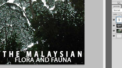
My poster is based on a simple and clean design.
Here are the steps to making my poster.
This is the photo I used in my poster which i took while I was at FRIM Kepong
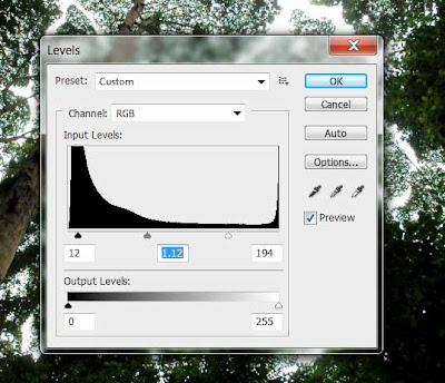
First I bump up the levels for the photo to enhance the contrast and brightness.
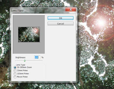
I then use the lens flare tool in the filter menu to add a sun glare to my poster.
I then use the brush tool and drop the opacity to 32% and create a dark vignette around the photo.

I then use Verdana as my font for the text in my poster.
Last, I use the blending tool to add and inner shadow and stroke to the text.


